Arche
Redefining the Fashion Platform Experience
Redefining the Fashion Platform Experience
Redefining the Fashion Platform Experience
Redefining the Fashion Platform Experience
Redefining the Fashion Platform Experience
Redefining the Fashion Platform Experience
Timeline
1 Month

Client
Arche
Industry
Fashion & E-commerce
Date
2025
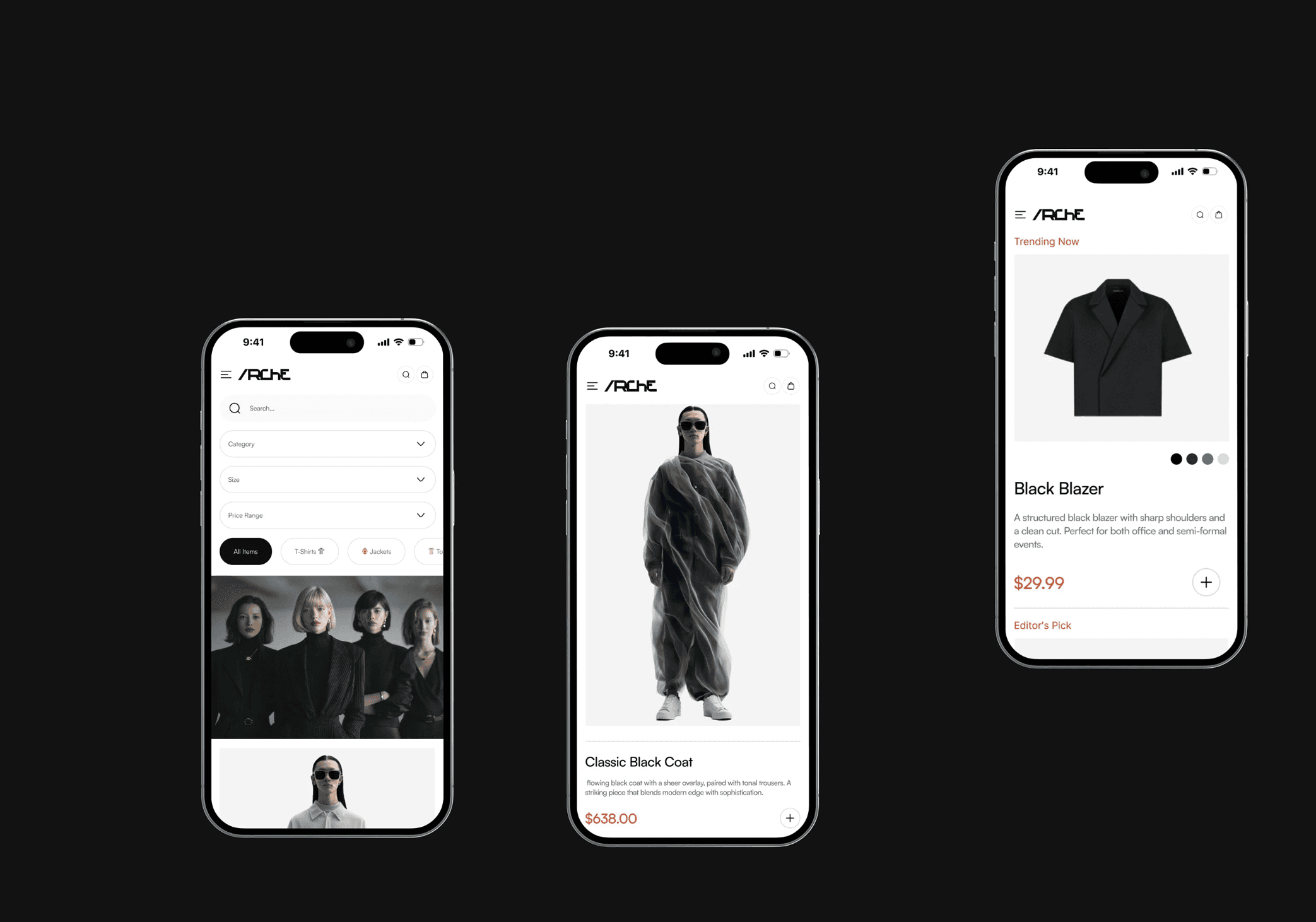
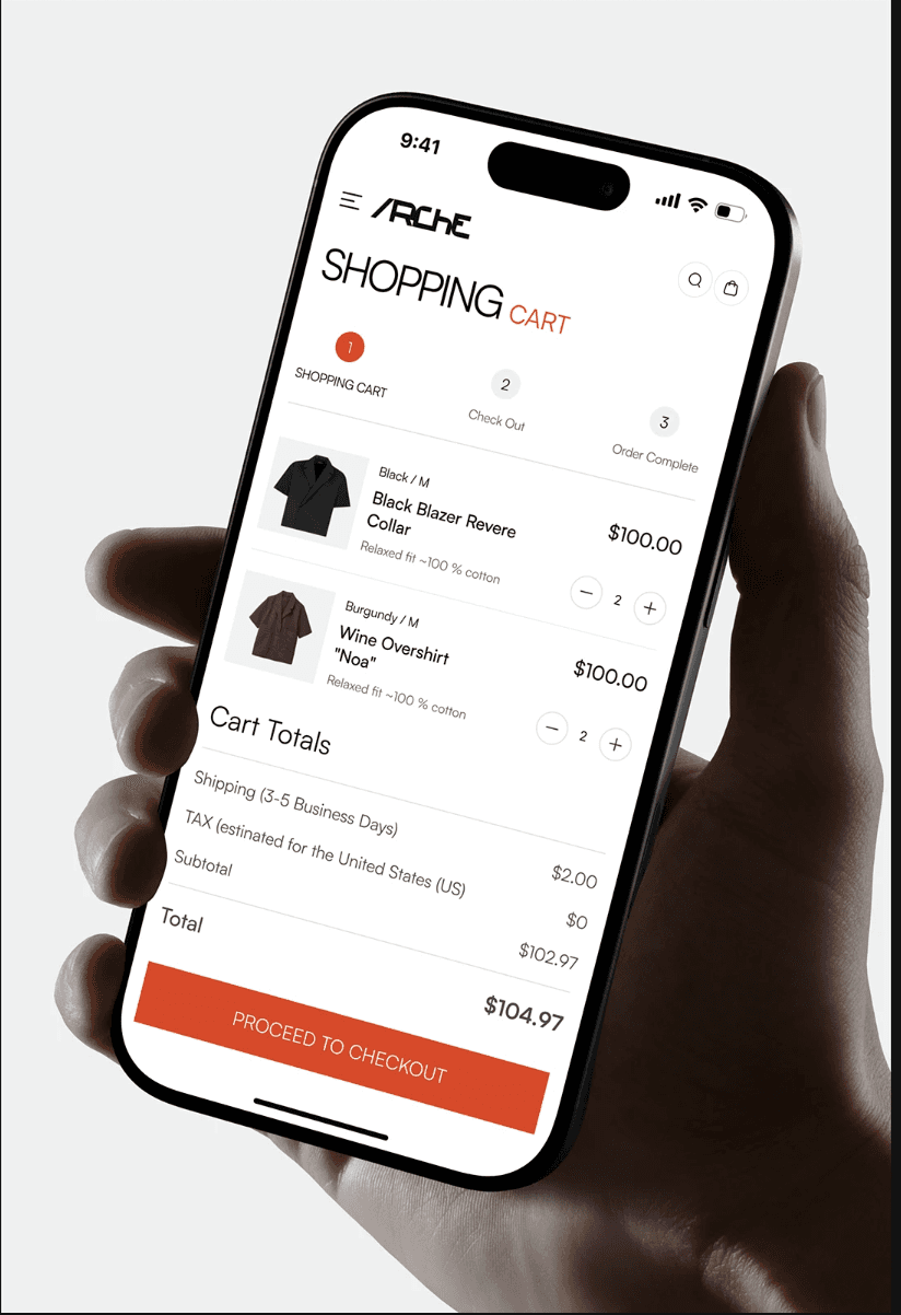
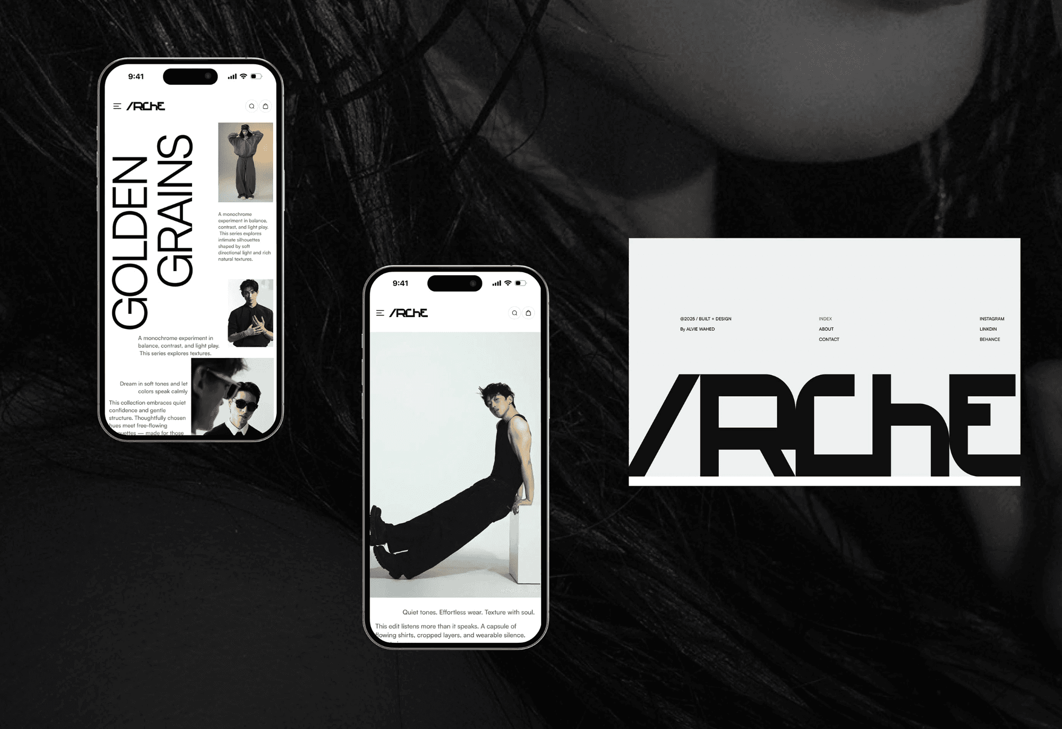
A modern fashion platform designed to bring together content, learning, and e-commerce in one clear and easy-to-use experience.
A modern fashion platform designed to bring together content, learning, and e-commerce in one clear and easy-to-use experience.
A modern fashion platform designed to bring together content, learning, and e-commerce in one clear and easy-to-use experience.
A modern fashion platform designed to bring together content, learning, and e-commerce in one clear and easy-to-use experience.
A modern fashion platform designed to bring together content, learning, and e-commerce in one clear and easy-to-use experience.
A modern fashion platform designed to bring together content, learning, and e-commerce in one clear and easy-to-use experience.
ARCHE needed a single, clear platform that combined fashion content, learning, and shopping without feeling cluttered.
ARCHE needed a single, clear platform that combined fashion content, learning, and shopping without feeling cluttered.
ARCHE needed a single, clear platform that combined fashion content, learning, and shopping without feeling cluttered.
ARCHE needed a single, clear platform that combined fashion content, learning, and shopping without feeling cluttered.
ARCHE needed a single, clear platform that combined fashion content, learning, and shopping without feeling cluttered.
ARCHE needed a single, clear platform that combined fashion content, learning, and shopping without feeling cluttered.
⌜CHALLENGE⌟



⌜APPROACH⌟
We started by understanding how people would move through the platform and what they needed to see first.
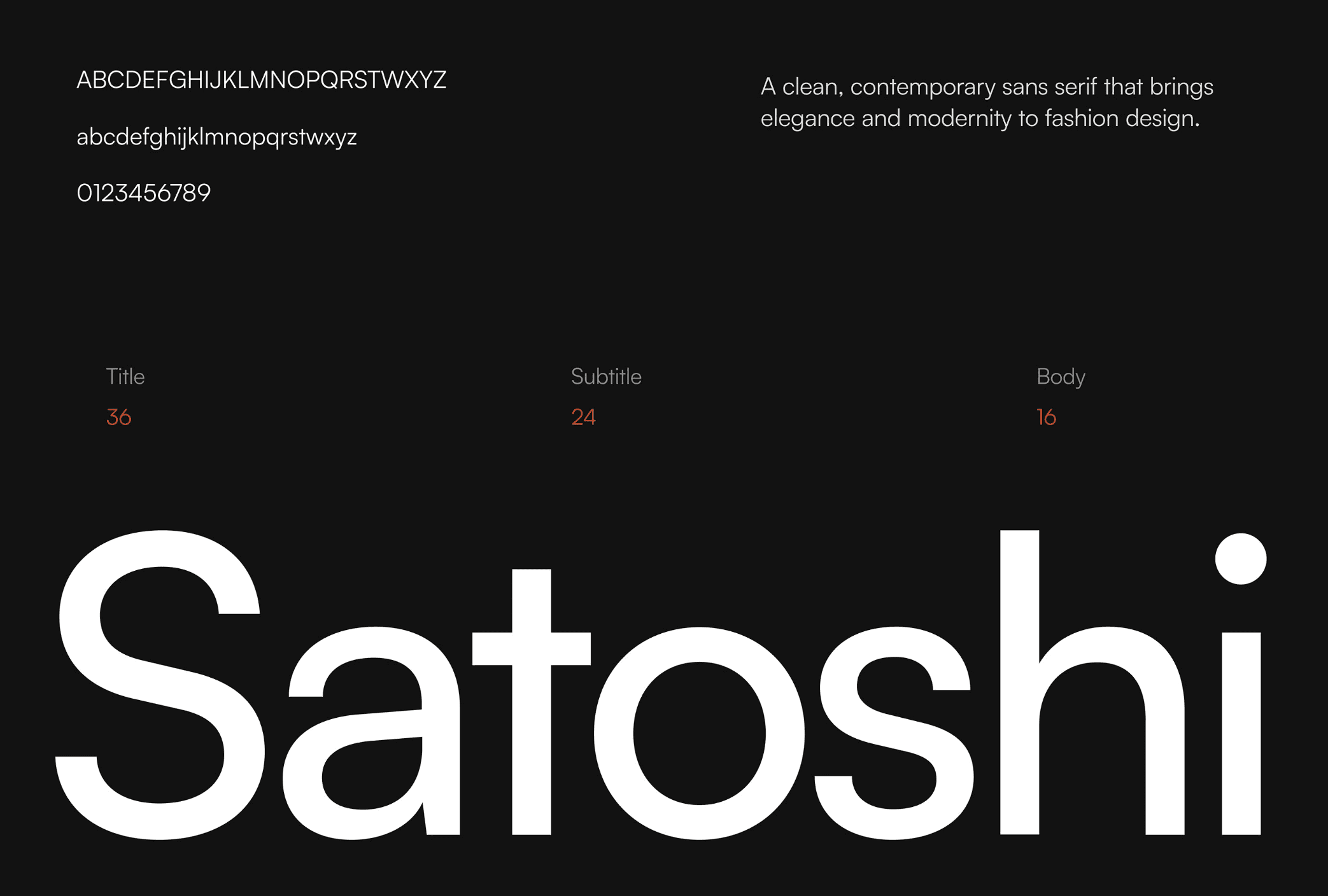
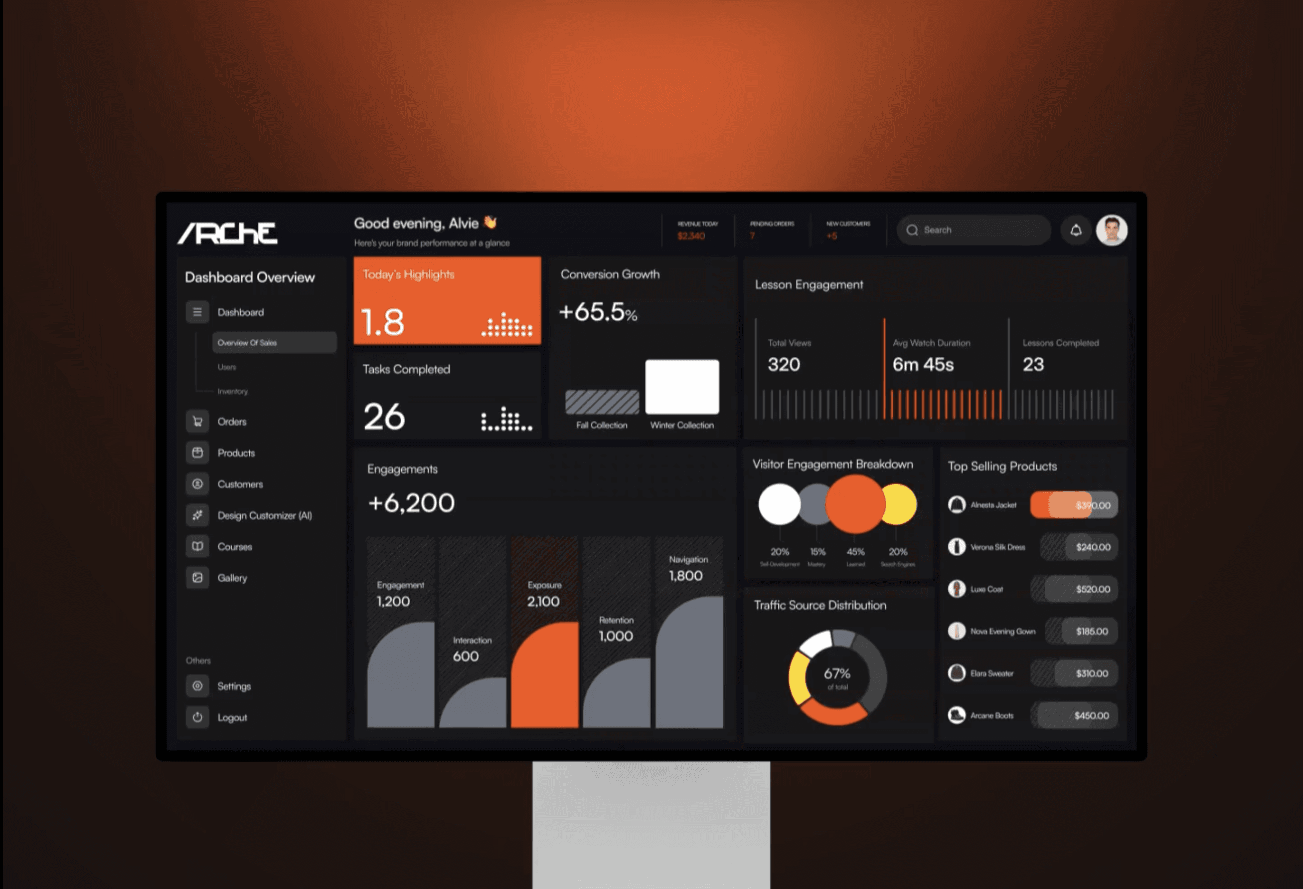
Instead of treating content, learning, and shopping as separate areas, we designed one clear structure that connects everything naturally. The layout was kept simple, with consistent spacing, typography, and navigation so users always know where they are and what to do next.
The visual style was designed to feel premium but calm, allowing fashion imagery and content to stand out without distraction. Every screen was refined to reduce clutter and make the experience feel smooth, intuitive, and easy to use across devices.
We started by understanding how people would move through the platform and what they needed to see first. Instead of treating content, learning, and shopping as separate areas, we designed one clear structure that connects everything naturally. The layout was kept simple, with consistent spacing, typography, and navigation so users always know where they are and what to do next. The visual style was designed to feel premium but calm, allowing fashion imagery and content to stand out without distraction. Every screen was refined to reduce clutter and make the experience feel smooth, intuitive, and easy to use across devices.
